
The Colour of Automation
FANUC is a global technology leader in factory automation, renowned for its legendary precision but lacking brand appeal in Europe. While competitors such as KUKA, ABB and Siemens have long been firmly established in the minds of customers in process industries such as automotive manufacturing, the Japanese player has remained, for many, too low-key, too technical and lacking a distinctive brand identity.

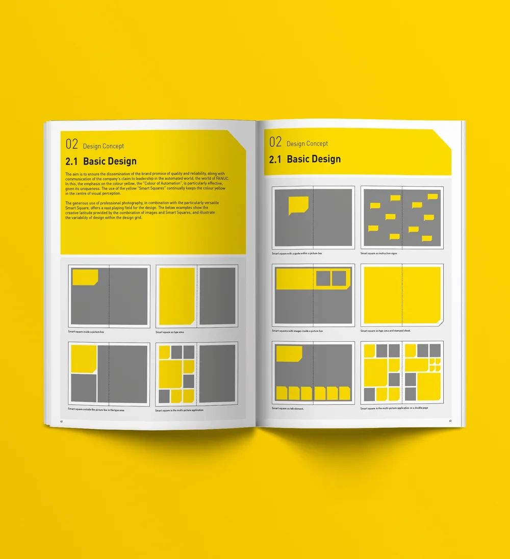
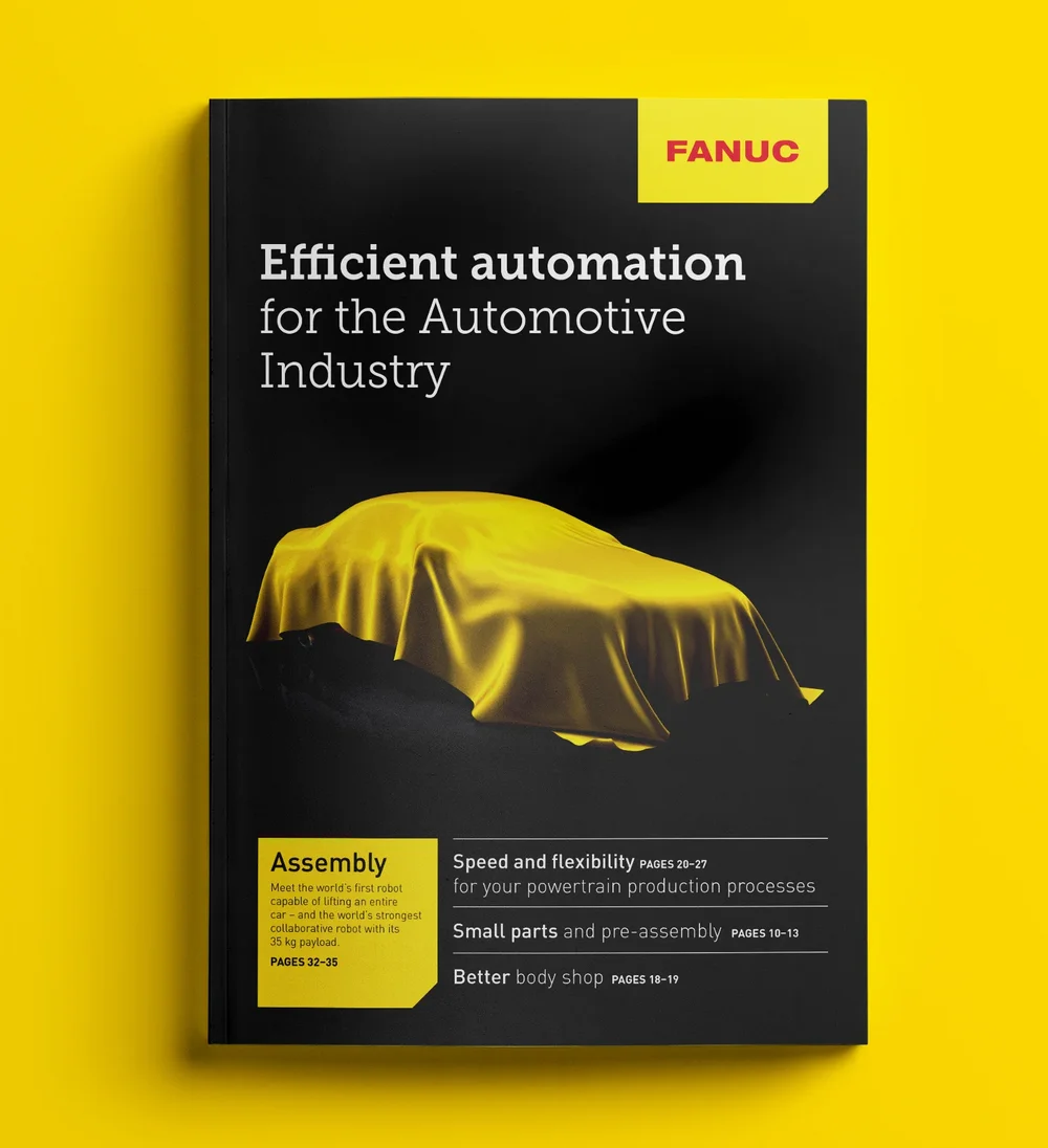
Brand workshops revealed what truly sets the company apart from its competitors and what matters most to its customers: maximum reliability rather than innovative features. Building on these insights, zuk. developed the new Europe-wide messaging and, with the slogan ‘The colour of automation’, combined with a distinctive corporate design and colour branding, created a strong, modern and recognisable brand identity.
Does your brand also need consistent, cross-border B2B branding?


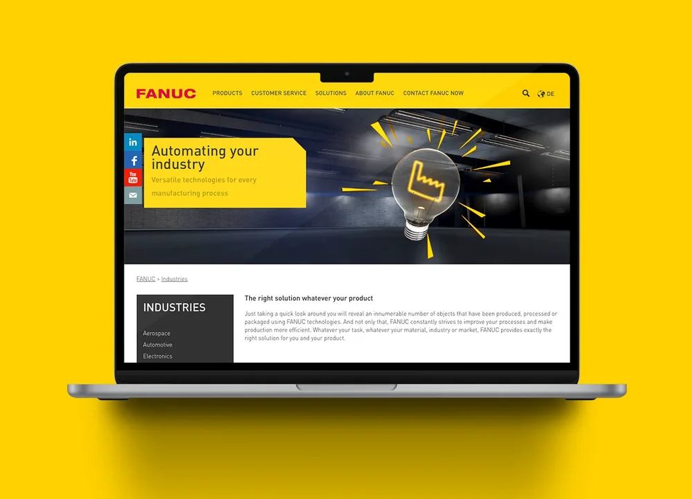
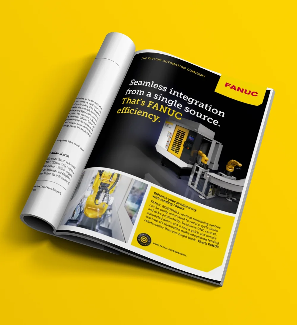
The biggest challenge during implementation was bringing all 26 of FANUC’s national subsidiaries together under one brand while still allowing room for local nuances. Our solution: a modular corporate design. A consistent visual identity combining product photography, 3D renderings and application photography. We also consolidated FANUC’s numerous country websites onto a single central platform. Where previously there had been little more than technical data sheets, we completely overhauled the content and created a coherent mix of literature and video. Brand awareness is strengthened through image campaigns and product launches, supported by a wide range of sales materials.
Market research confirms that ten years of investment in branding and brand communication are paying off. Today, FANUC is regarded across Europe as the brand offering the highest level of reliability – a perception reflected in consistently rising turnover. And one benefit should not be underestimated: the strong sense of identification employees feel with the ‘yellow world’.
Olaf Gehrels
, President and CEO of FANUC Europe Corporation

Whatever challenge you’re facing, we’re here to help. As B2B Communication Guides, we analyse your brand’s performance, identify strategic opportunities and develop a tailored solution that creates measurable value for your business.
Do you have any specific questions about your brand and communications? Ulli Eiden (CEO) looks forward to an initial brainstorming session.
Contact details Email